
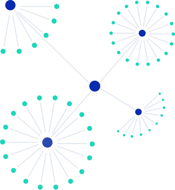
Collapsible Trees
The Collapsible tree layout shows a multilevel hierarchical view and allows the user to manage a small group of data at any time. The first layer provides the genes under analysis. Each node of interest can be expanded or collapsed as needed to keep the view clear and deal with a manageable chunk of information at a time. The second layer lists the popular topics associated with the gene. The next level provides text clusters for the topic of interest. Finally, each cluster can be further expanded to view the detailed text itself.
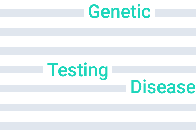
Word Cloud
A word cloud takes the user directly to the text clusters of interest and immediately provides an appreciation for the significance of each. All topics are presented within a single view, with the topic size scaled appropriately to reflect its impact. This allows the inspection of the more frequent phrases and themes before moving on to additional texts.
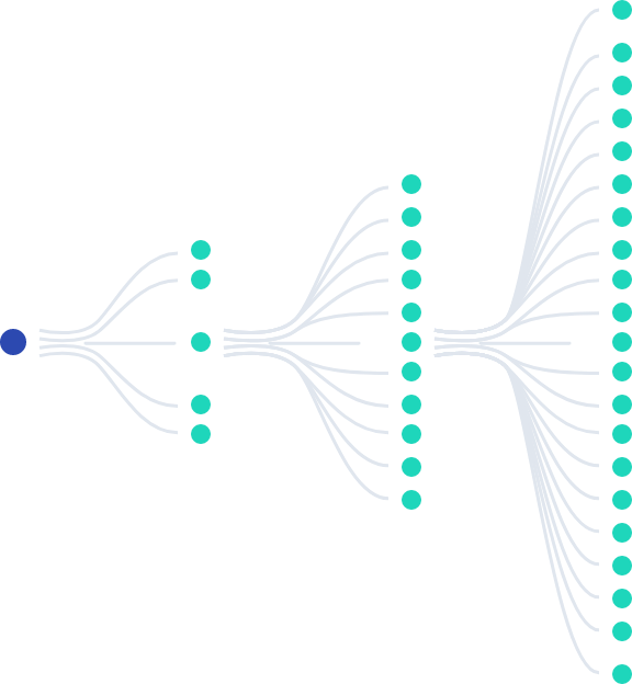
Force Directed Graph
This visualization has some similarity to the Collapsible tree layout. The view starts as a fully grown tree, originating at the center and extending outwards. Each layer of the expanding tree is colored coded to show its position in the hierarchy and the density of attached nodes shows how that topic might have flourished. The nodes can be temporarily collapsed to provide more focus to the other points of interest. Details attached to a specific node can be examined by hovering over it to examine what it represents.
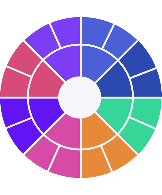
Sunburst Diagram
A Sunburst has some similarities to a pie chart, if one can visualize the pie to consist of several concentric layers with each outer layer providing some additional flavor. Every layer is sliced in proportion to the information content it contains, while maintaining its relationship with the inner circle that created it. Any slice, regardless of its overall positioning, can be provided full focus temporarily by selecting it to observe its full details and just easily be defocused to get back to the full view
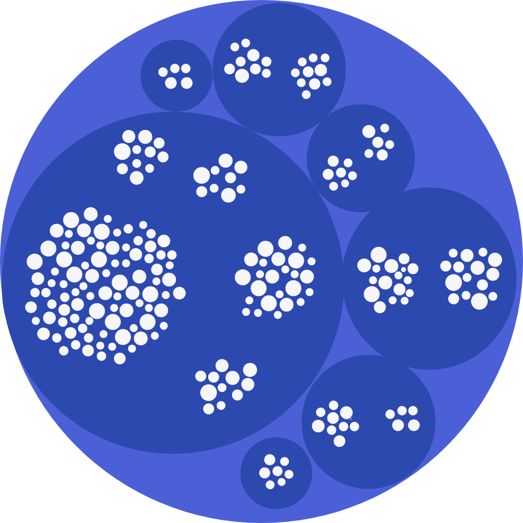
Packed Clusters
Packed Cluster layout starts with a high level view of the data, showing how it is packaged in a single glance. Each tier is represented by a packed bubble, with its size proportional to the content it carries inside. Selecting a bubble allows zooming into it for a closer look and exploring it more. The process continues at each level until the finest of details is visible at the innermost molecule of information.